MAKSZ
Visual identity for MAKSZ, Hungary’s professional association for agencies in the communications industry.
Ügynökségek Szövetsége
MAKSZ represents and connects communication agencies across Hungary, providing a shared platform for professional dialogue, knowledge exchange and the representation of shared industry interests.
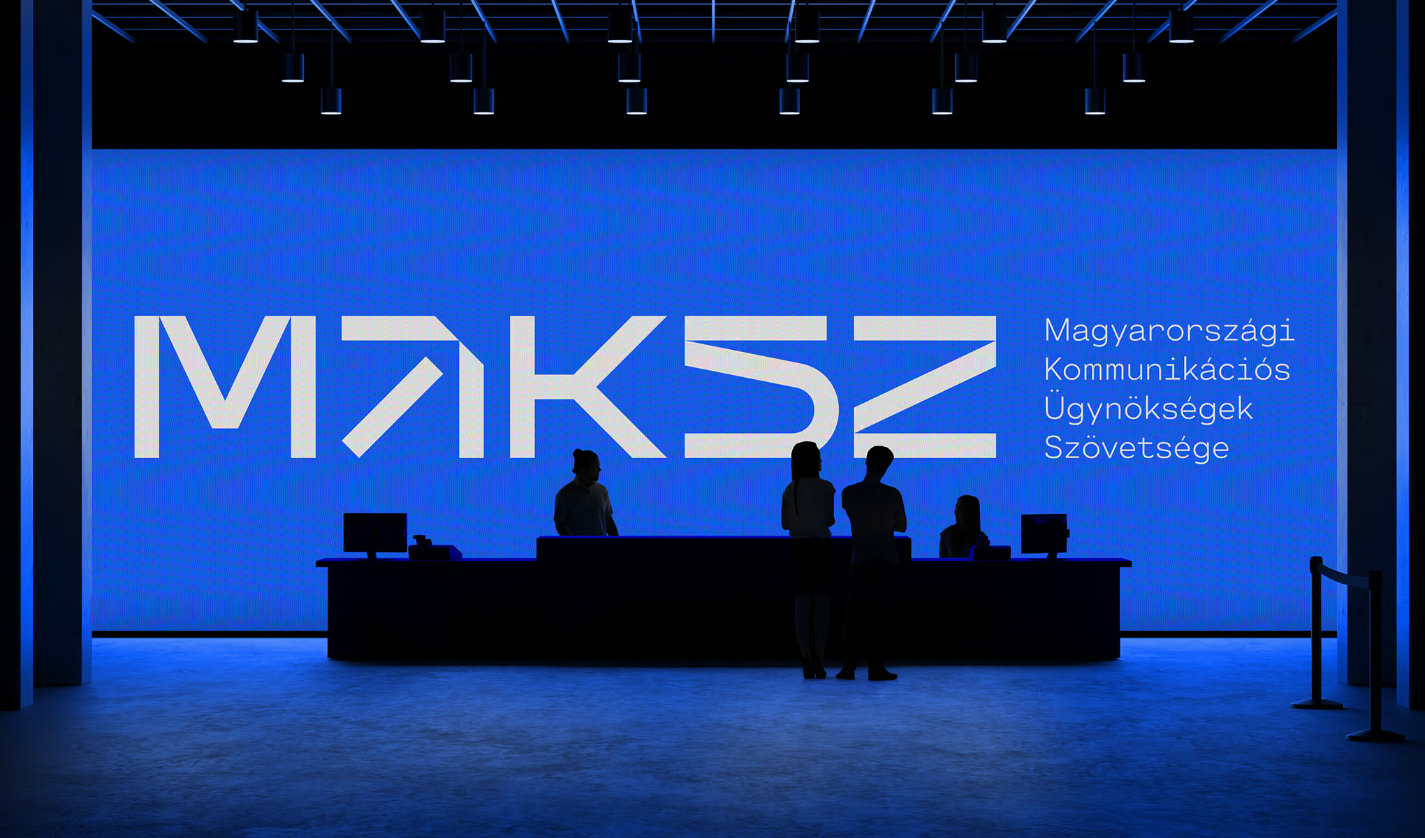
The identity translates this role into a contemporary visual system: credible enough for an established professional association, yet direct and energetic enough for a changing industry. A custom wordmark, a high-contrast palette and a family of abstract symbols create a consistent language across publications, digital communication and events.
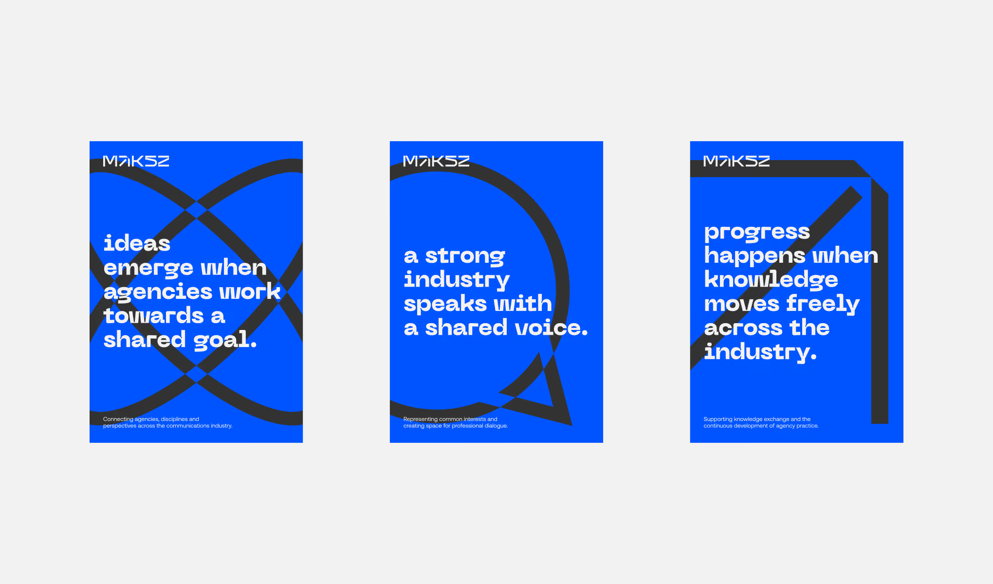
The wordmark is built from angular cuts, open forms and directional gestures that suggest movement, exchange and forward momentum. Its geometry extends into a family of symbols based on recurring themes within the profession, including connection, perspective, knowledge and progress.
Rather than functioning as a fixed icon set, the symbols form a modular toolkit. They can frame content, overlap, scale and extend beyond the edges of a format, allowing each application to feel distinct while remaining recognisably MAKSZ.
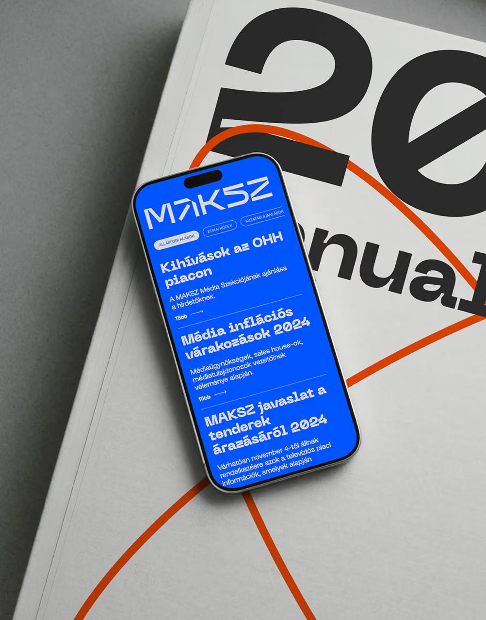
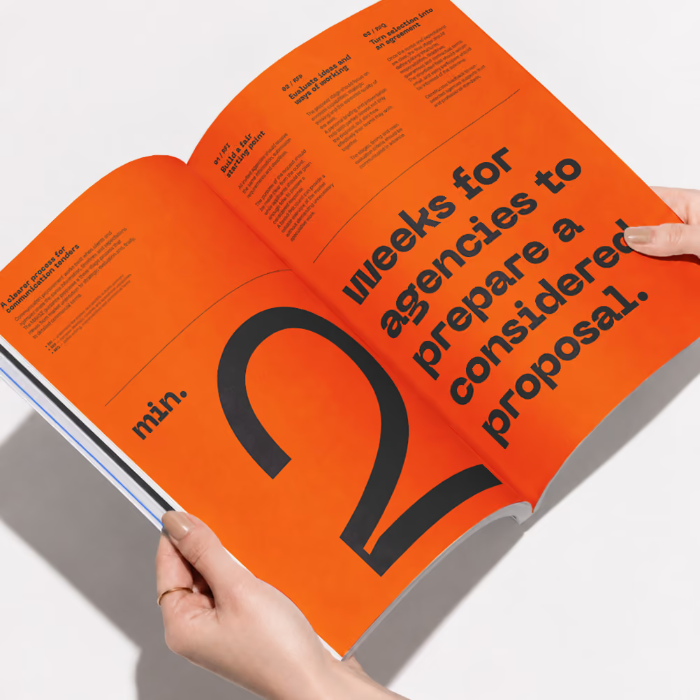
Bold typography, controlled colour contrasts and modular geometric forms give the system its recognisable visual rhythm.
Rather than relying on a single template, the elements can be recombined across different formats. This keeps the identity consistent without making its applications repetitive or overly rigid.
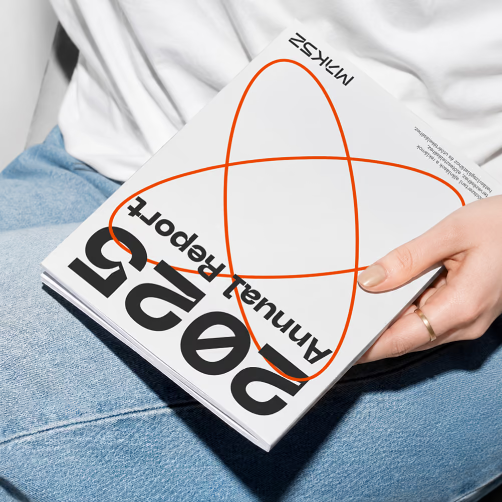
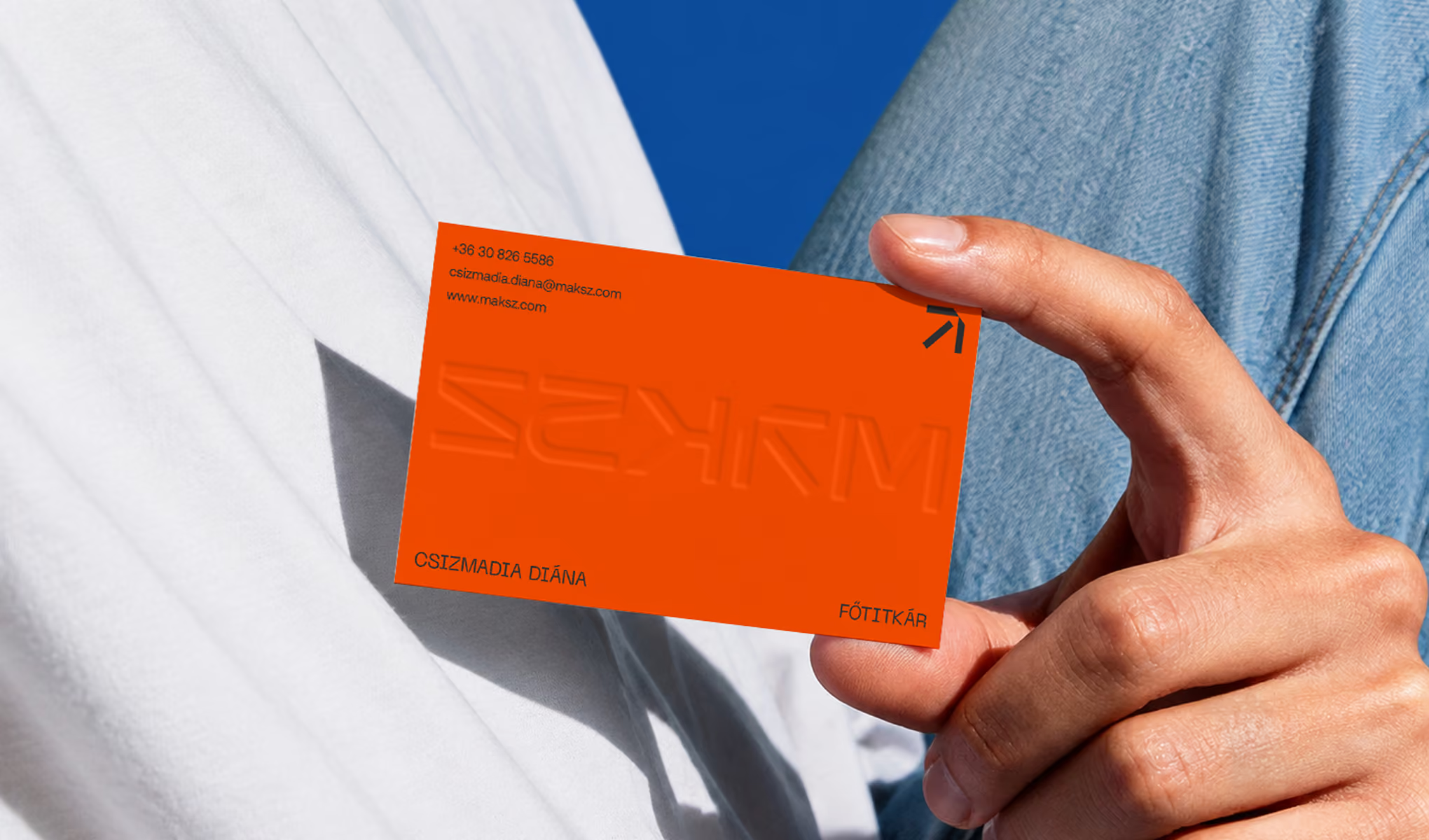
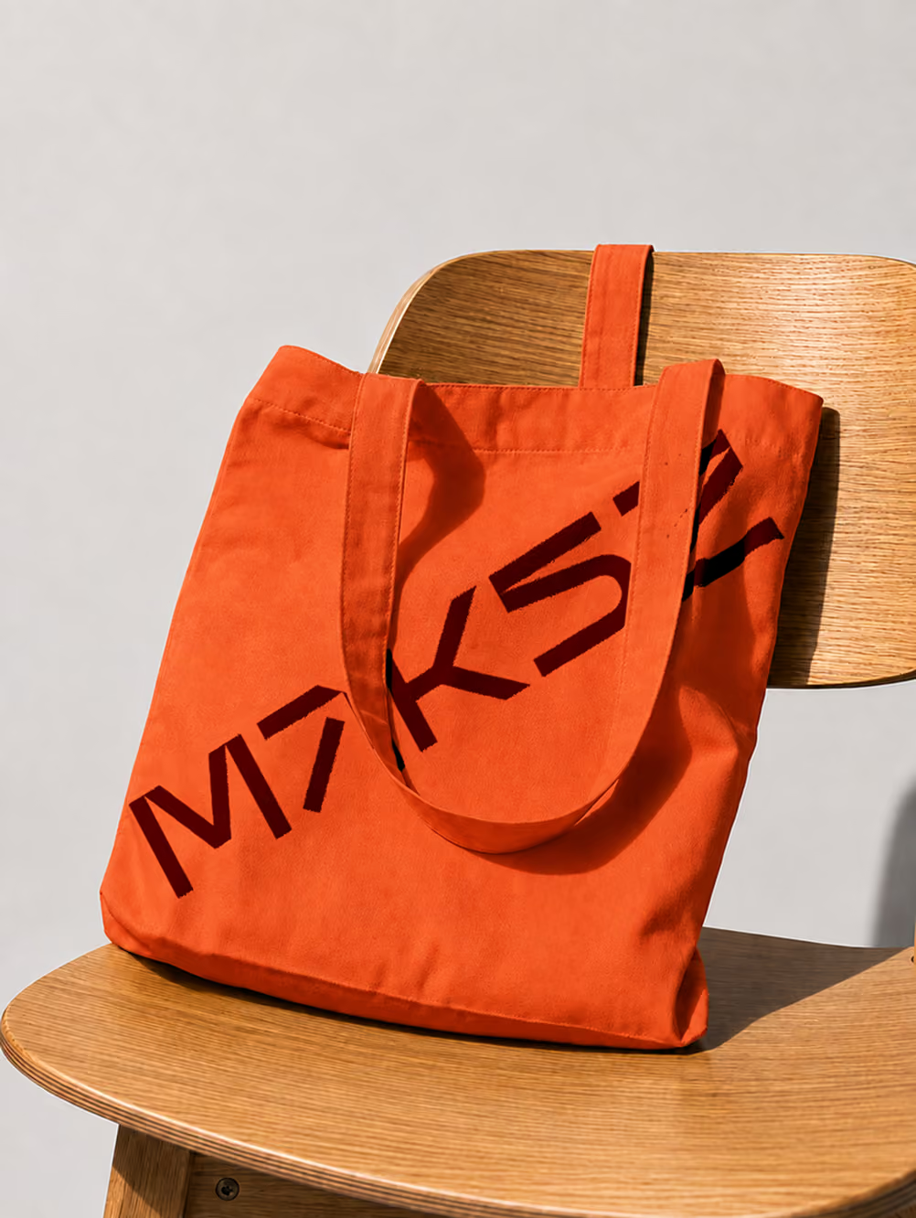
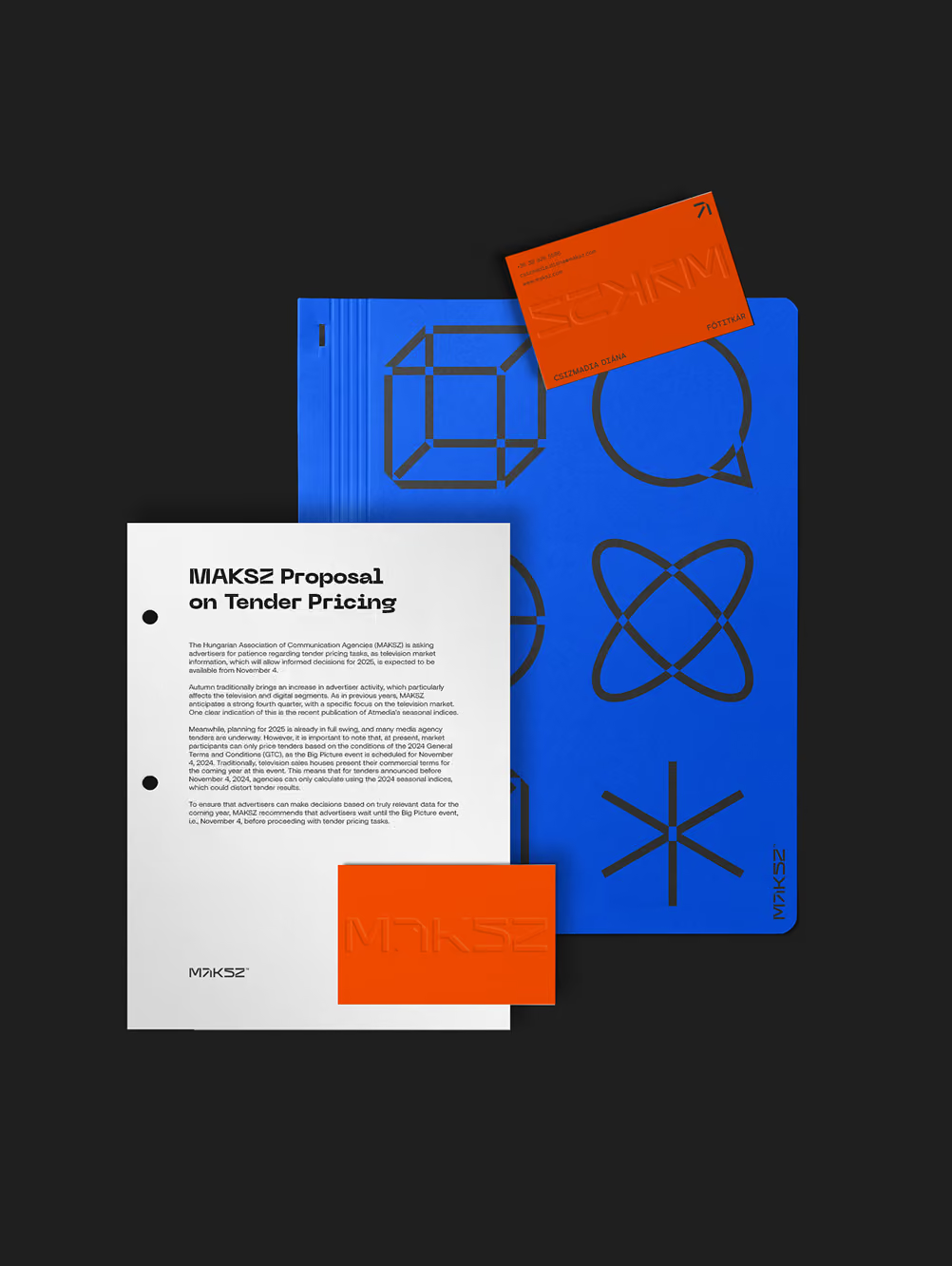
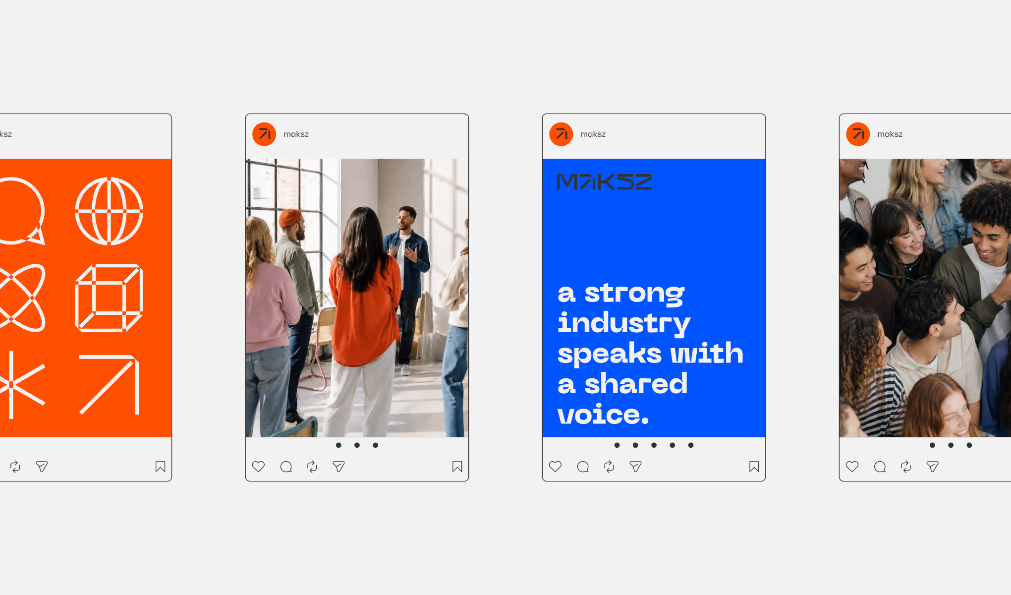
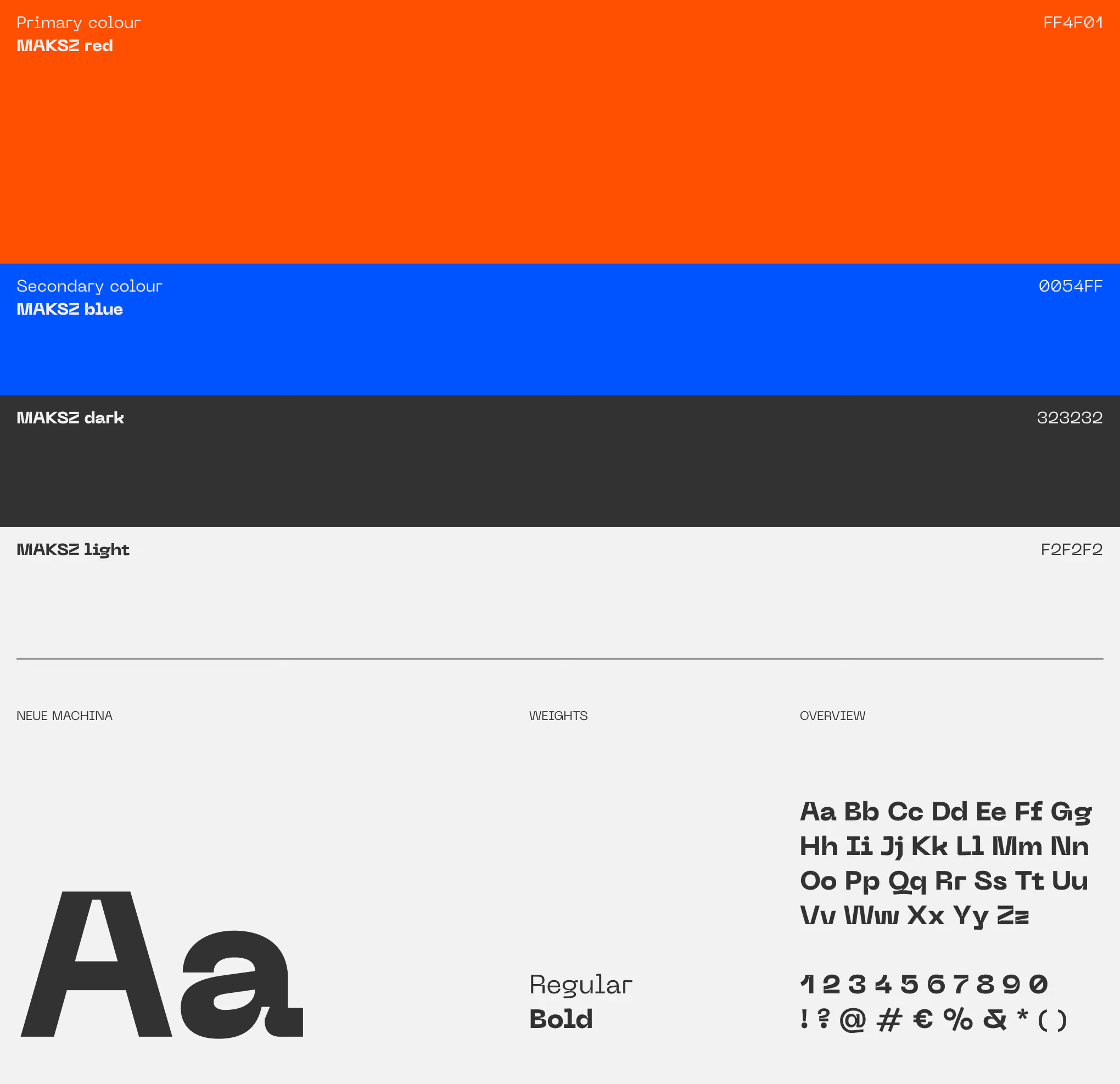
MAKSZ red and blue provide the identity’s main visual contrast, supported by a dark neutral and an off-white base. Neue Machina echoes the engineered geometry of the wordmark while remaining practical across both display and text-led applications.